
2023 Color of the Year

A Closer Look at our Favorite Colors of the Year for 2023!

Pantone Color of the Year. Viva magenta.


2023 has officially begun, which means that major players in the world of color have begun to announce their favorite hues for Color of the Year. From Pantone’s bold Viva Magenta to Glidden’s peaceful Vining Ivy, we’ve had a chance to pour over 2023’s Colors of the Year, and we’re excited to share a closer look at some of our favorites. 


Why is the Color of the Year so meaningful?

When a paint or color company announces their Color of the Year (COTY), they are essentially making a prediction that a certain color will have a major impact in the world of interior design for the rest of the year. While some folks out there may be skeptical of the motives of these companies, it seems like most if not all of the businesses that announce a COTY actually put a lot of time and money into the selection process. They employ teams of experts that look at sources from all over the world to try and get a feel of trends happening in interior design, fashion, social media, entertainment, as well as innovations taking place throughout a range of major global industries. Once the team feels like they have a good grip on what’s trending in terms of color, and on the general public sentiment of what’s happening in the world around us, they look for a new color that will be both in line with the interests and emotions of the global population and that will provide a fresh perspective or way of thinking that will be beneficial in the new year. 

In a way, the Color of the Year is almost like a New Year's resolution of sorts. It's an attempt to say "this is a color we need in our lives for this coming year because it will help us move on from the past and embrace the future in a particular way that many people will resonate with." 

Whether or not you agree with a particular company’s Color of the Year, it would be hard for anyone to say that these particular colors have little influence in fashion, interior design, and furniture. Since Pantone started the COTY phenomenon back in the year 2000, more and more people have been paying attention to COTY announcements and finding ways to incorporate the proclaimed colors in their lives. Today, many paint companies declare their own Color of the Year selections to the world at the start of the new year, and there are thousands of people throughout the design industries who wait with baited breath to see what this year’s most in-demand colors are going to be.


What colors were people expecting for 2023?

To give some context into the Colors of the Year for 2023, we should first take a look back at how things have been changing in the world at large over the last few years. Over the last decade or so, with more and more attention being paid to what the human race is doing to the environment, there has been a growing interest in nature and the natural world. Once all of our lives were upended in 2020 with the COVID-19 pandemic, this feeling of needing to embrace nature for the wellbeing of ourselves and society has grown exponentially, which has been majorly impactful in the world of furniture and interior design. Before this change, light neutrals held sway as dominant contemporary paint colors for decades, and new furniture was all about clean, straight lines and crisp modern finishes. After the pandemic hit, it was almost as if we collectively became tired of austere neutrals tones turned back towards the soothing colors of nature. Collectively across the world, people became more interested in painting their walls in warm earth tones or soothing shades of green, and furniture manufacturers started to produce more and more furniture that showcased organic shapes and emphasized natural materials. 

The “back to nature trend” continued to grow throughout 2020 and 2021, and as we made our way through 2022, it was generally expected that the upcoming COTYs would continue the trend of turning toward nature. In fact, in 2022 most people in the industry were fairly certain that paint and color companies would all land on shades of green for 2023. So what happened? Are this year’s Colors of the Year all about soothing natural tones, or did some companies have some surprises in store for us? To answer this, let’s start by looking at the most well known and influential company in the Color of the Year game: Pantone.

Pantone Color of the Year. Viva magenta.

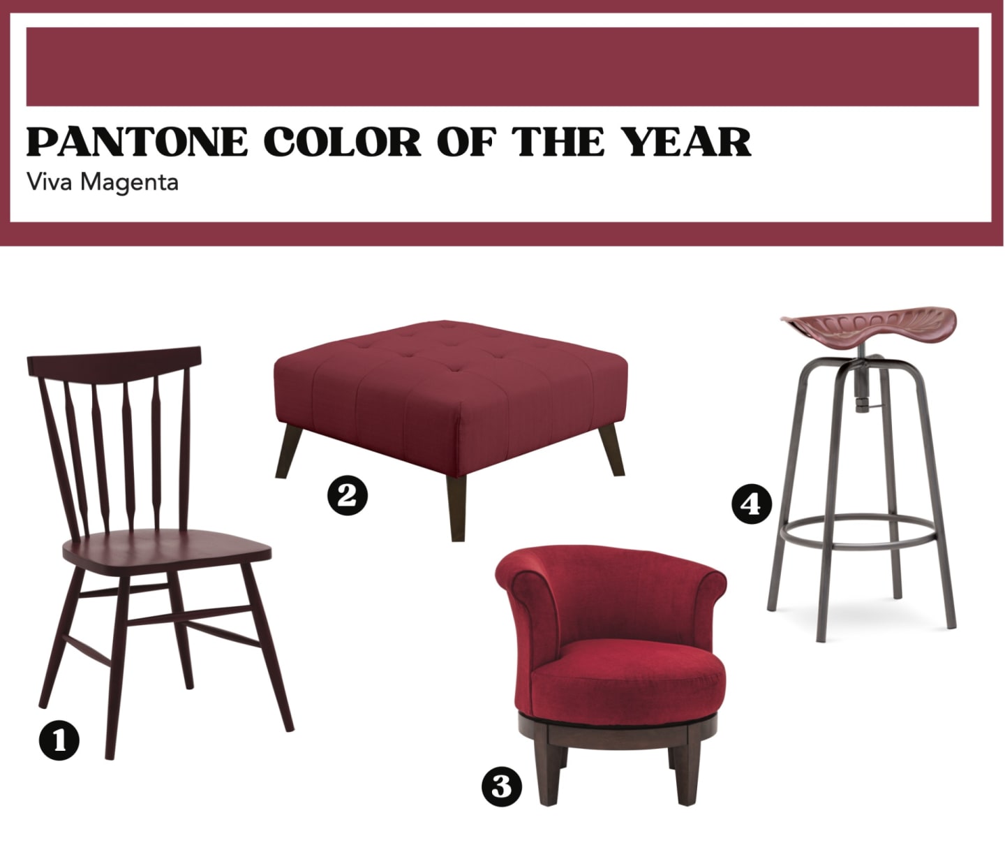
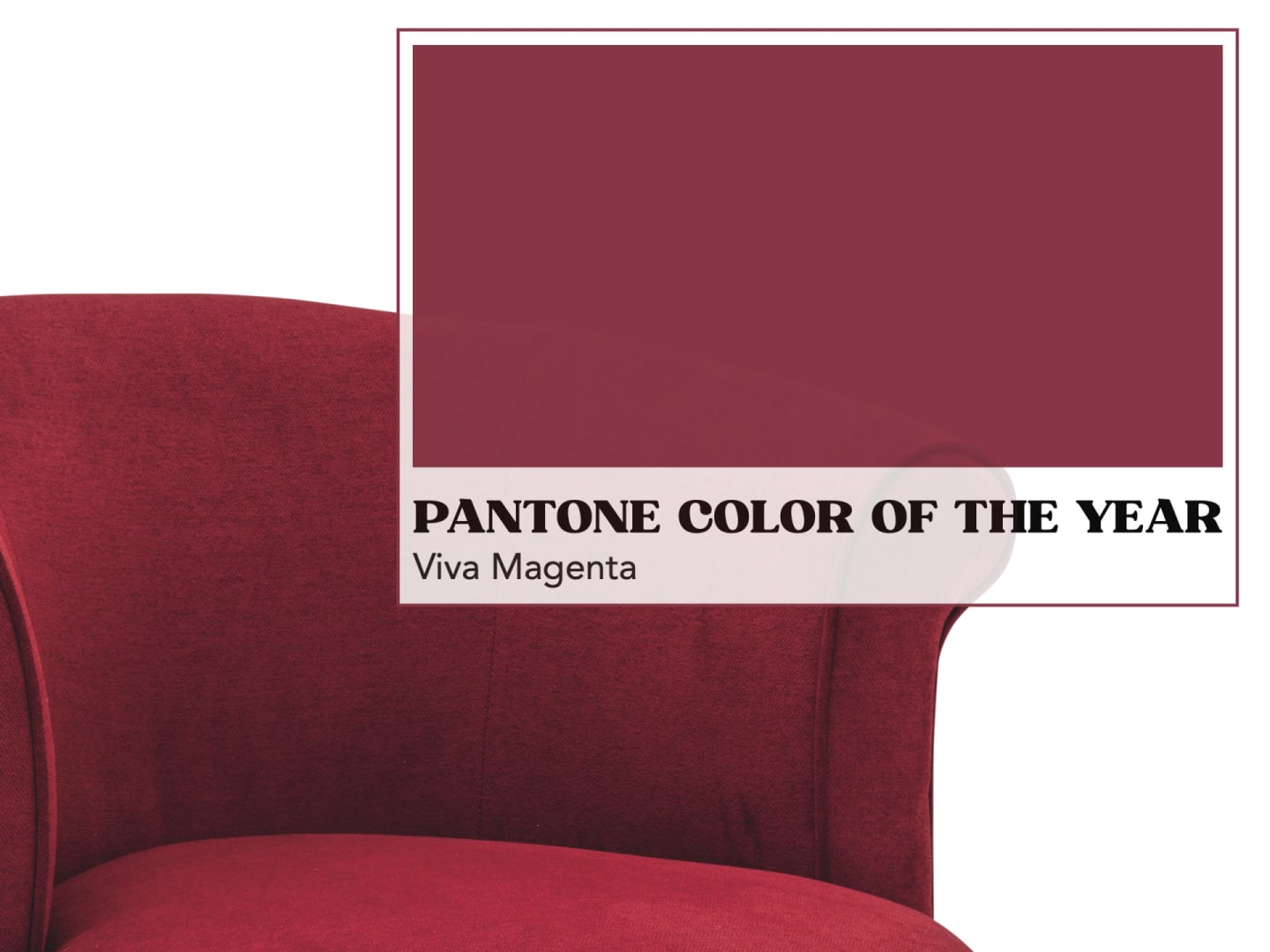
Pantone - Vivia Magenta

Pantone’s 2023 Color of the Year is Viva Magenta, a rich crimson red that is, according to their website, “brave and fearless, a pulsating color whose exuberance promotes a joyous and optimistic celebration, writing a new narrative.” 

To arrive at this exciting color, Pantone’s team of color experts looked at the countless lifestyle trends happening in all sectors of modern culture. Like many others, they noticed a heightened appreciation and awareness of nature. People everywhere are incorporating more living things into their living spaces, and they’re finding newfound enjoyment in travel, sports, and outdoor recreation. Additionally, people are also looking to protect their bodies by eating healthy and trusting in traditional, life-giving medicines. All of these lifestyle trends speak to the appeal of natural forces in our lives.

While it may not seem like it at first glance, Pantone contends that Viva Magenta is actually a shade taken directly from nature because it comes from the cochineal beetle. The cochineal beetle is an insect that we use to produce carmine dye, which is one of the strongest and brightest natural dyes ever to be made. 

So Viva Magenta is a color taken from nature, but why did they land on this particular shade for 2023? Well, According to Pantone, “Viva Magenta offers us the assurance and motivation we need to weather long-term disruptive events. Three years deep into a pandemic, facing a war, an unstable economy, social unrest, supply chain breakdowns, and mounting climate change, we need to heal. And still, we need to find the motivation to continue. Here, Viva Magenta cloaks us in both power and grace, and sends us out into the world with the verve we’ve yearned for.”

If this color and the meaning behind it resonates with you, you’re not alone! We absolutely love Pantone’s color choice for 2023, and we even have some products that evince this stunning shade that you can add to your collection today. Many would agree that such a bold shade works best as an accent piece rather than the color of an entire room. Luckily we have a few brand new accent pieces that evince the Viva Magenta red, or at least a shade close to it. The Colors II Side Chair and the Culver Ottoman in Berry are both perfect examples of eye-catching accents with Viva Magenta coloring while the Tyler II Accent Chair  and the Tractor Seat Barstool both can be ordered in complementary shades of red that deliver many of the same feelings of strength and inspiration. 

Pictured Above
1. Colors II Side Chair | 2.Culver Ottoman | 3. Tyler II Accent Chair | 4. Tractor Seat Barstool


Some of our other favorite COTYs for 2023

Krylon color of the Year. Spanish Moss. Mika Ottoman.


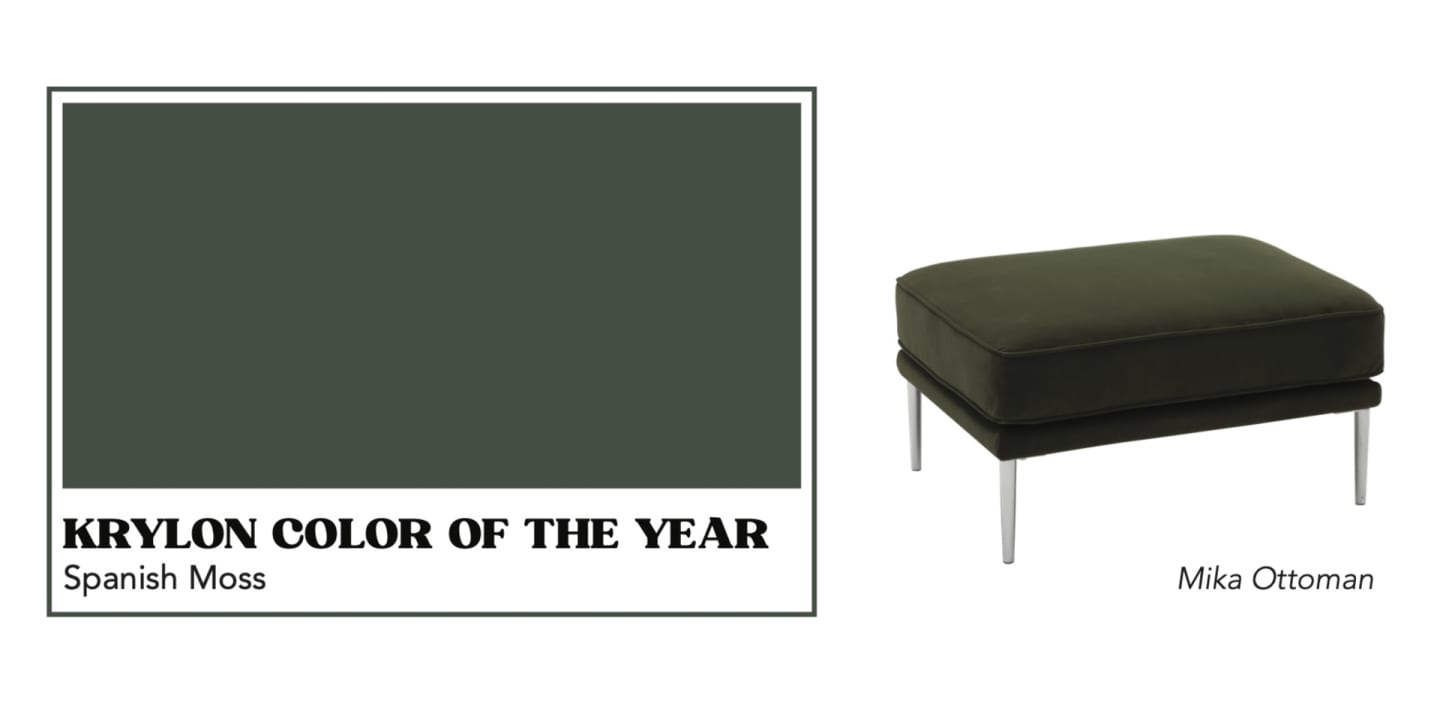
Krylon - Spanish Moss

More in line with public expectations for 2023, Krylon’s Color of the Year is a deep shade of green called Spanish Moss. According to their announcement, Krylon wanted to choose a shade of green because they saw that it was replacing crisp, bright whites of decades past.  Spanish Moss is an effortless nod to nature, and it’s a spray paint shade that can be easily used to upgrade furniture and decor that can work alongside practically anything. 

Ashley Banbury, senior color designer for Krylon, said in the company’s press release, "This midnight green has a strong connection with the richness of nature, dense forests, and mossy terrains. Rooted in the renewing power of green, it can balance with both warm and cool accents.” 

Here are some of our favorite products showcasing Spanish Moss-like greens. The Finley 2 Pc. Sectional and the Garberville Sofa are both available in shades of green similar to Spanish Moss, and so are the Taryn Accent Chair, the Quill Accent Chair, and the Mika Ottoman, if you’re looking for a splash of the dark green color rather than an entirely new seating arrangement. 

Pictured Above
Mika Ottoman

Sherwin Williams Color of the Year. Redend Point

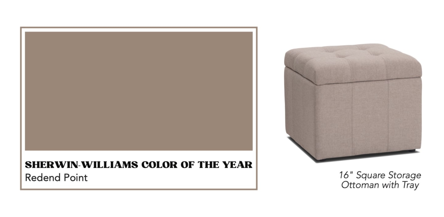
Sherwin Williams - Redend Point

Redend Point is Sherwin Williams’ 2023 Color of the Year. It’s a warm neutral color that’s a mix between blush and beige, a grounded tone that blends the energies of playful pinks and steadying earth tones which can work equally well in a creativity-inspiring office and a cozy, comforting reading nook.

"We wanted the 2023 Color of the Year to reflect what we've been seeing in terms of neutrals warming up," explained Sue Wadden, director of color marketing at Sherwin-Williams. "Homeowners are opting for warmer whites, beiges, pinks, and browns. Redend Point SW 9081 is an earthy color, and its subtle pink undertones exude a feeling of warmth and exploration—something people want to feel in their homes. It also leans into the macro trends we're seeing around empathy and care culture. While self-care is incredibly important, care is also about looking out for each other and our communities."

If you’re wanting to incorporate this earthy color into your home, then be sure to consider creamy upholstered pieces with subtle pink undertones like the 16” Square Storage Ottoman with Tray or the Stylus Sofa. You can also opt for alluring accent pieces with rose colored tints such as the Grace Glass Table Lamp, the Aria Crystal Table Lamp, or the Faux Rabbit Fur Throw Pillow in Mauve. 

Pictured Above

16" Square Storage Ottoman with Tray

Glidden Color of the Year. Vining Ivy.

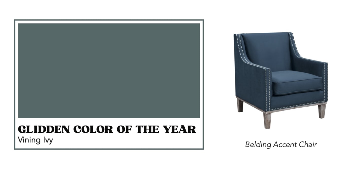
Glidden - Vining Ivy

In yet another nod to nature, Vining Ivy by Glidden blends blue and green to create a tranquil backdrop for any space, and it has the added benefit of working well with both contemporary and classic styles. 

According to Ashley McCollum, Glidden Color expert,  Vining Ivy is, “energizing yet grounding, and it works in literally any space. Its versatility takes the guesswork out of design, leaving consumers with more time to indulge in the things that matter most to them."

Glidden recommends pairing their blue-green jewel tone with wood finishes, stone accents, and rich textures to create a look that echoes the outdoors, or you could always opt for smaller doses of Vining Ivy on trim, furniture, or cabinetry for a subtle dose of the soothing paint color.

If you need this soothing color in your life, then you’re in luck because we have both large-scale furnishings and smaller accents in shades similar to Vining Ivy. The Belding Accent Chair and the Perkins Upholstered Bed come in cerulean shades similar to Vining Ivy, as do the 

Tivoli Table Lamp and Micro Velvet Throw Pillow in Peacock. 

Pictured Above

Belding Accent Chair