
Furniture Row’s Color of the Year 2026: Powder Blue Skies
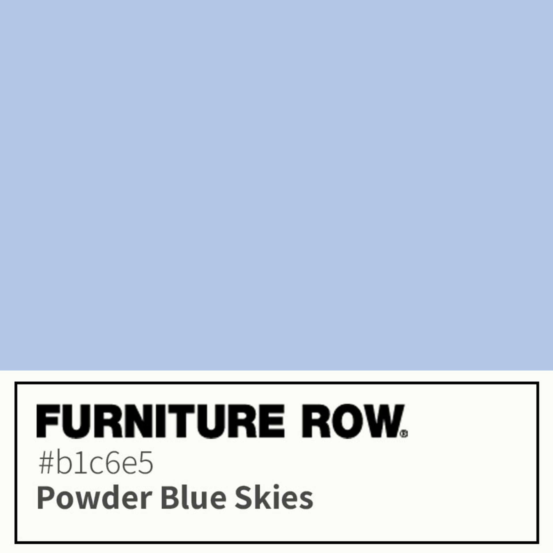
Introducing Furniture Row’s Color of the Year for 2026—Powder Blue Skies.
Powder Blue Skies is a refreshing shade of pale blue that designers are loving right now. It’s light, clean, and optimistic—exactly the kind of color that blurs the line between past and present, making any space feel timeless, fresh, and anything but stuck.
Why a Furniture Row Color This Year? A Neutral White Wasn't Cutting It...
It’s officially Color of the Year season in the interior design world, and brands are racing to reveal their picks for the next big thing. Of course, no announcement gets more buzz than Pantone—the reigning king of color—who just named its 2026 Color of the Year: PANTONE 11-4201 Cloud Dancer, "a lofty white neutral meant to bring a calming influence."
While we love the folks at Pantone, and we always appreciate a beautiful neutral, we have to admit this year’s pick left us wanting a little more…well, color! So, we decided 2026 deserved a Furniture Row Color of the Year that makes a statement.
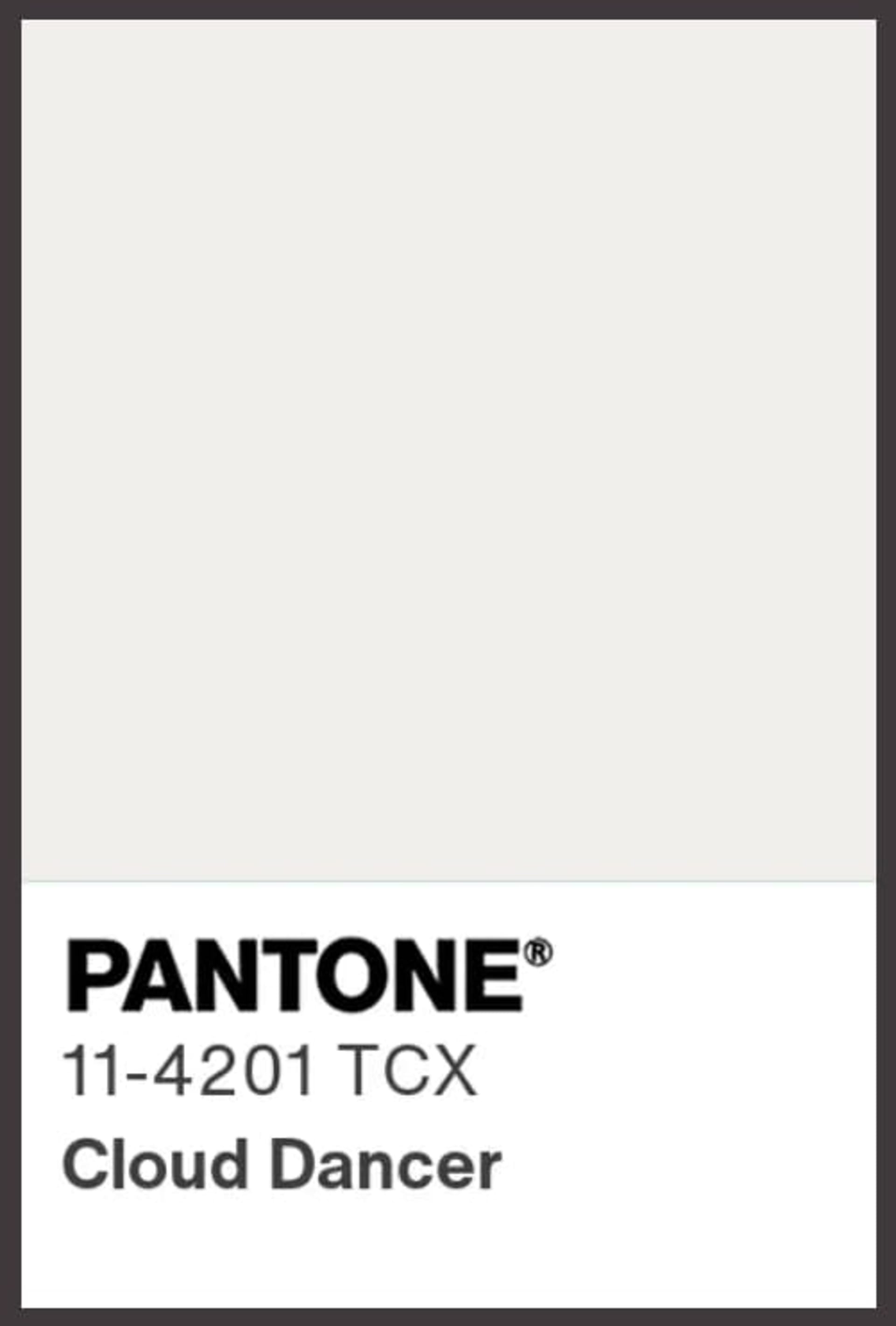
Cloud Dancer is described by Pantone as a “lofty white that serves as a symbol of calming influence in a society rediscovering the value of quiet reflection.”
Powder Blue Skies Is Having a Moment
Get ready to celebrate because the design world is officially ready for color again! After years of beige minimalism and greige everything, designers are bringing in lighter, brighter hues that still feel soothing (not shouty)—colors that lift a space without taking it over.
That’s exactly why we chose Powder Blue Skies for our Color of the Year: it captures that fresh, airy “new year” feeling while staying easy to live with. And the best part? Powder Blue Skies isn’t a single shade—it’s a blue that shows up in a range: sometimes it’s powder blue, sometimes it’s soft sky blue, and sometimes it leans a little cornflower, but the vibe is always the same: clean, optimistic, and instantly uplifting.
Our designers have spotted this uplifting blue everywhere, from the showrooms at High Point Market to the stunning interiors at the Kipps Bay Decorator Show House in New York City. It’s a color story that’s dominating upcoming 2026 collections and turning heads throughout the interior design world—a trend we dove deep into in our 2026 design trends post.

Pinterest 2026 Palette: Cool Blue
Did you see that Pinterest spotlighted “Cool Blue” as one of its official 2026 Pinterest Palette picks? It's a crisp, frosty light blue with major trend momentum. It’s essentially a cousin to Powder Blue Skies, and it backs up what we’ve been noticing out there in the wild: pale, airy blues are showing up more and more in real homes, mood boards, and new design inspiration.
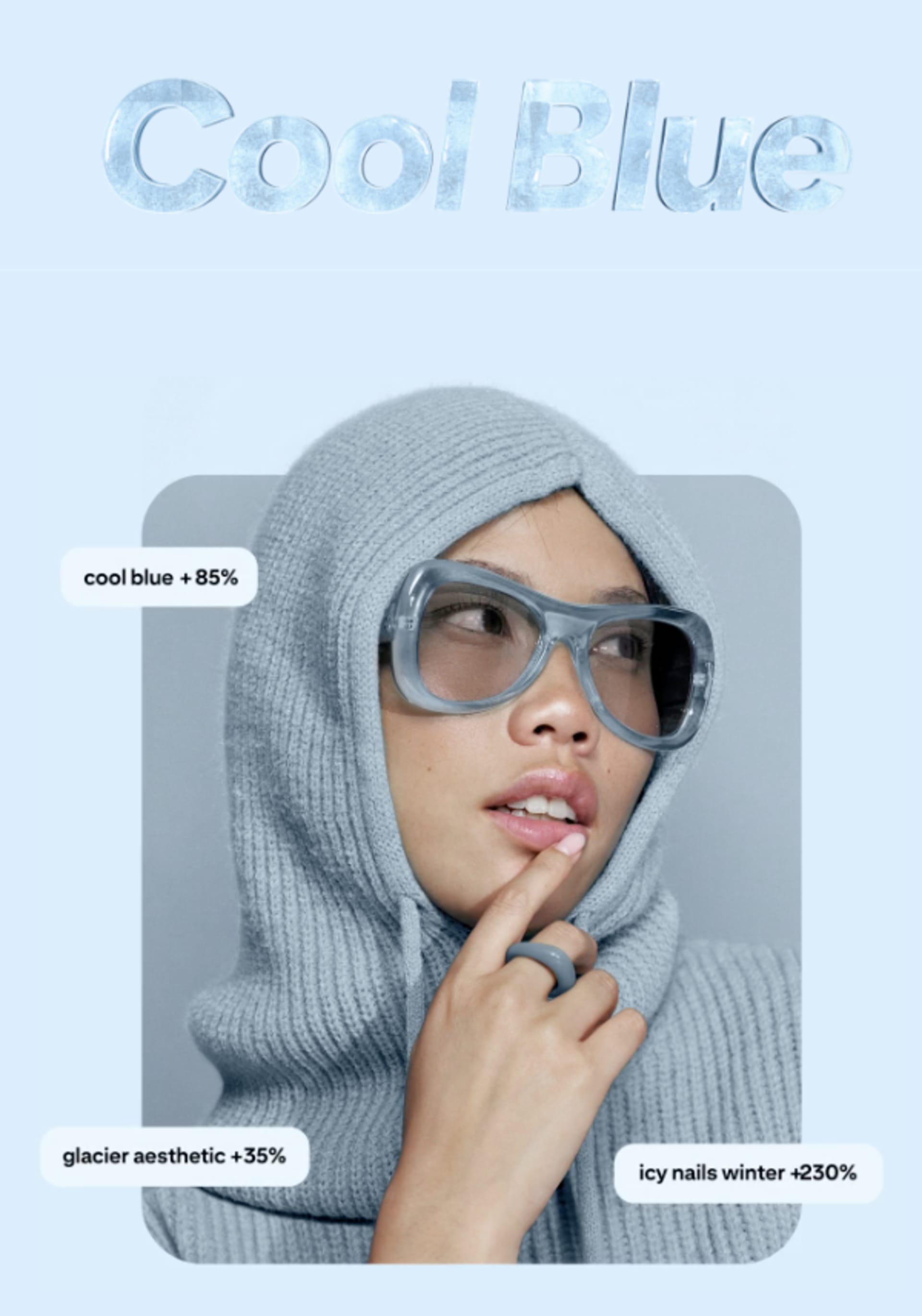
According to Pinterest, Cool Blue is "the shade that’s iced out in the nicest way. This frosty hue adds a stone cold chill to everything it touches.”
What makes Powder Blue Skies so irresistible? It Blends the Future with the Past
The main reason Powder Blue Skies is showing up everywhere in interior design is that it doesn’t belong to just one era—it floats between them. It has that forward-leaning, glossy optimism we remember from Y2K visuals (think icy gradients, chrome accents, and digital-future vibes), but it also reads polished and timeless in traditional spaces.
At the same time, soft blues have real history in interiors—Victorian-era homes used blue painted walls and blue-toned wallpapers more than people assume, including lighter duck-egg and pale blue moments that still look refined today. That’s the magic: Powder Blue Skies can make a room feel current without cutting ties with classic design
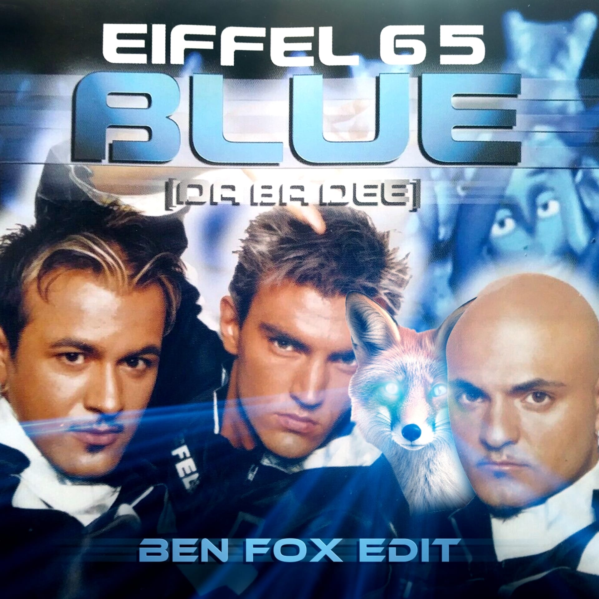
Y2K Blue Album Art

Victorian Blue Examples
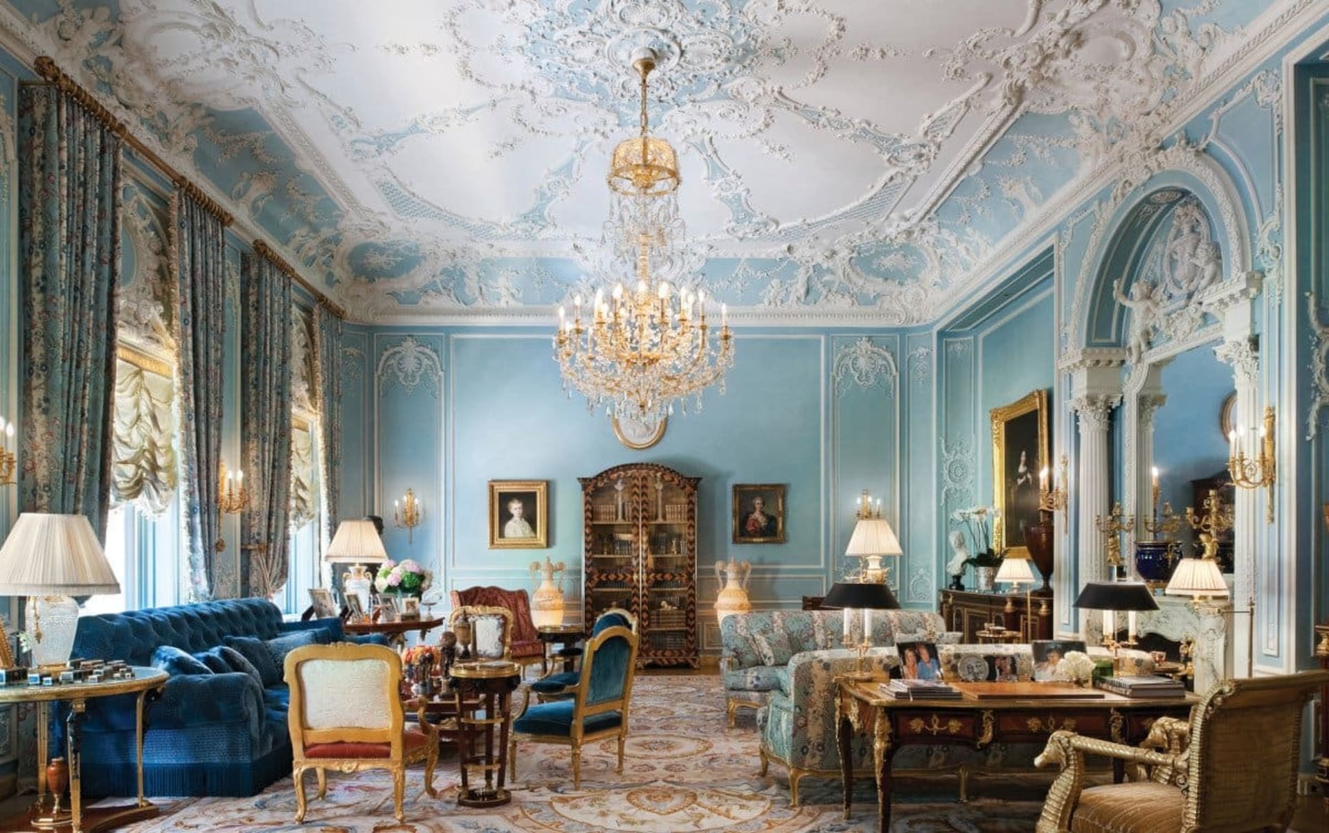
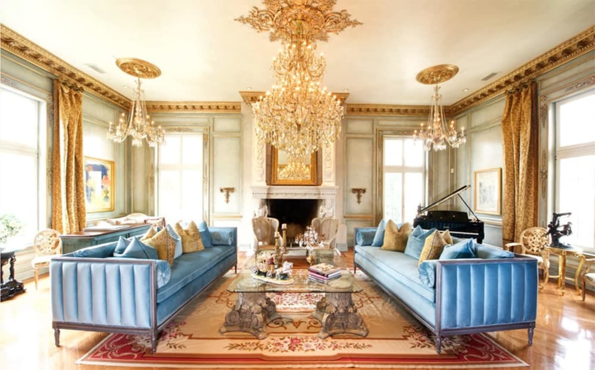
(Image credit: Pale Blue Victorian Living Room & Sky Blue Tuxedo Sofas)
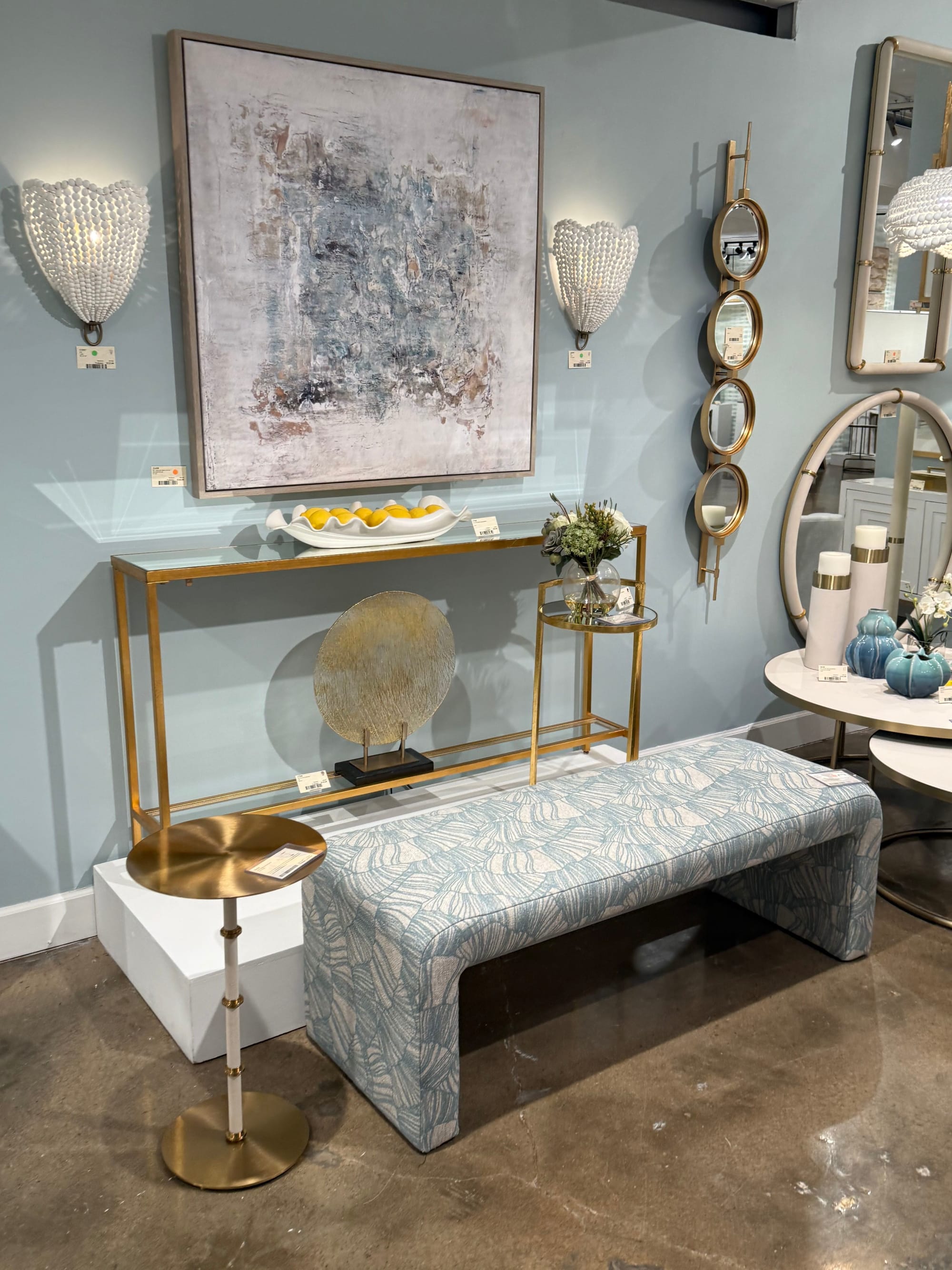
Colors That Make Powder Blue Skies Sing
Foundational Color Pairings
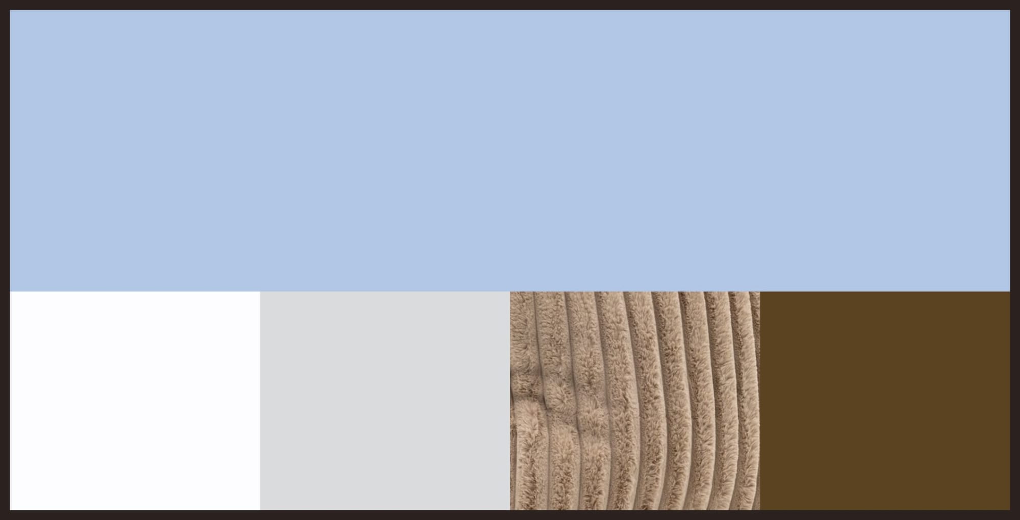
Foundational colors are the neutral backbone of your room—typically making up walls, large furniture pieces, and flooring. Powder blue pairs beautifully with classic neutrals that allow it to shine:
- White: Creates balance, enhances brightness, and keeps sky blue from feeling too moody.
- Grey: Adds sophistication and emphasizes powder blue's subtle elegance.
- Beige & Cream: Bring warmth and create a harmonious, inviting look.
- Brown & Tan: Rich wood tones and light tan wood tones ground powder blue with earthy warmth.
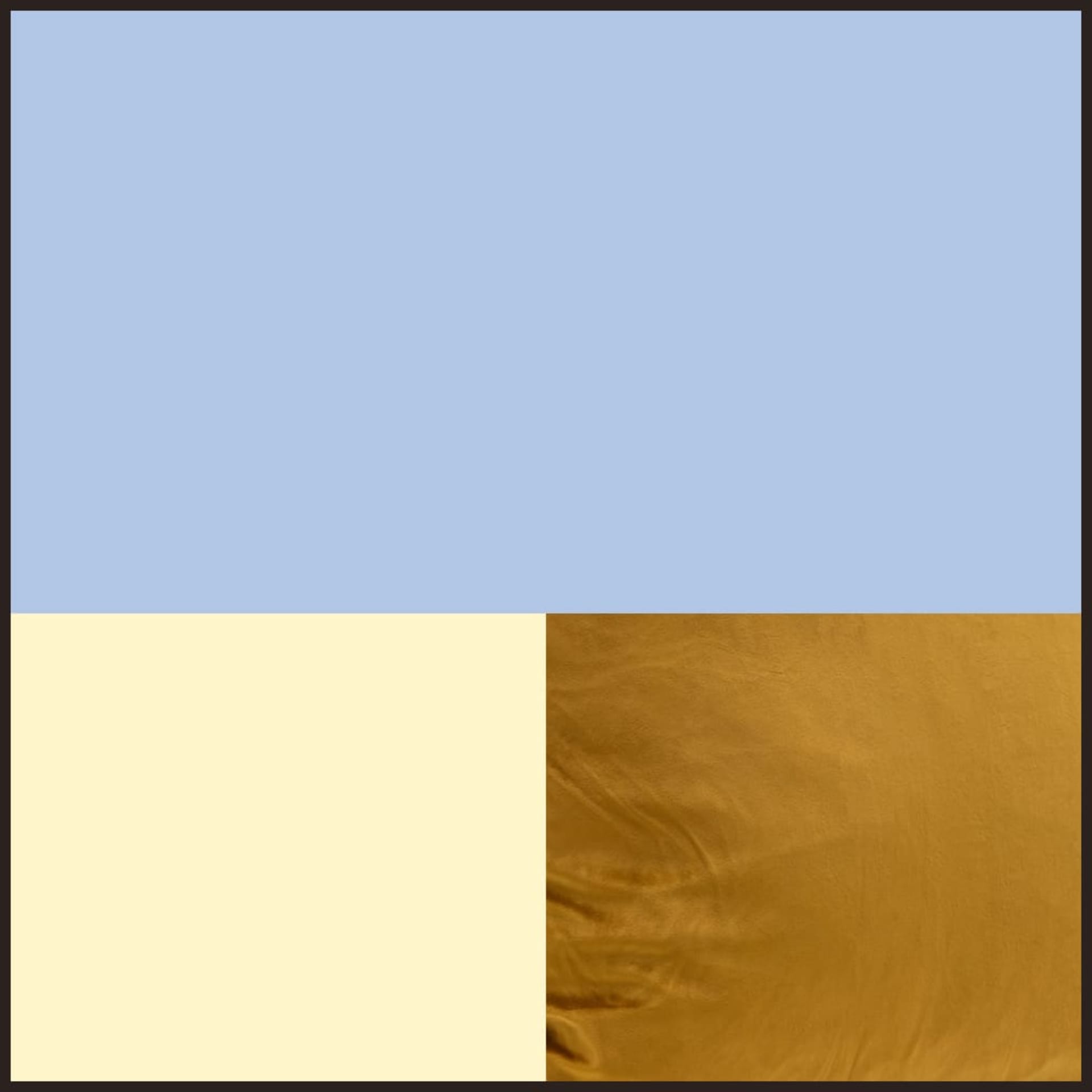
Complementary Accent Colors
Beyond your neutral foundation, these accent colors work harmoniously with Powder Blue Skies in smaller doses—think artwork, textiles, and decorative accessories:
- Soft yellows: Make light blues pop without overwhelming; think buttery yellows rather than neon.
- Muted oranges: Create a striking contrast with warmth; burnt orange and rust tones work particularly well.
- Golden yellow: Offers a balanced, distinct mood that's both warm and inviting.
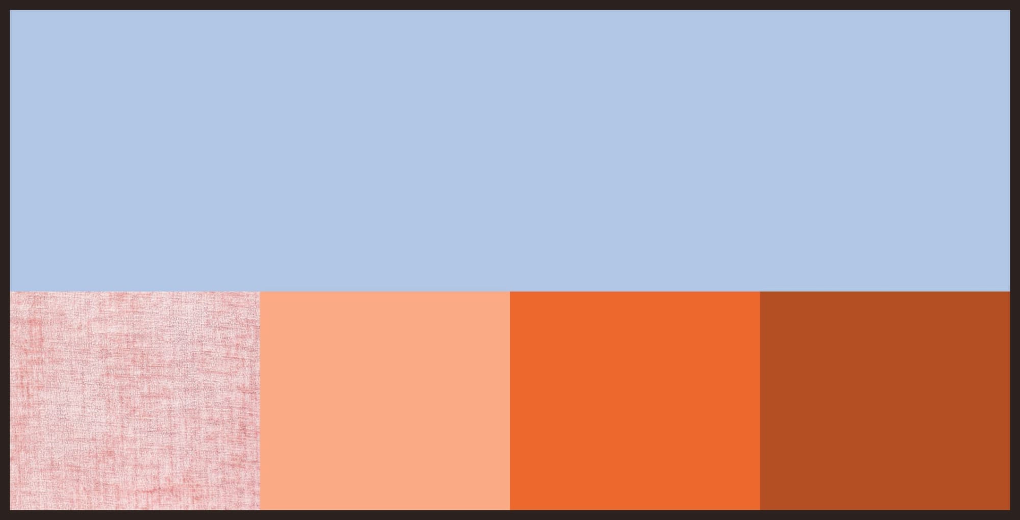
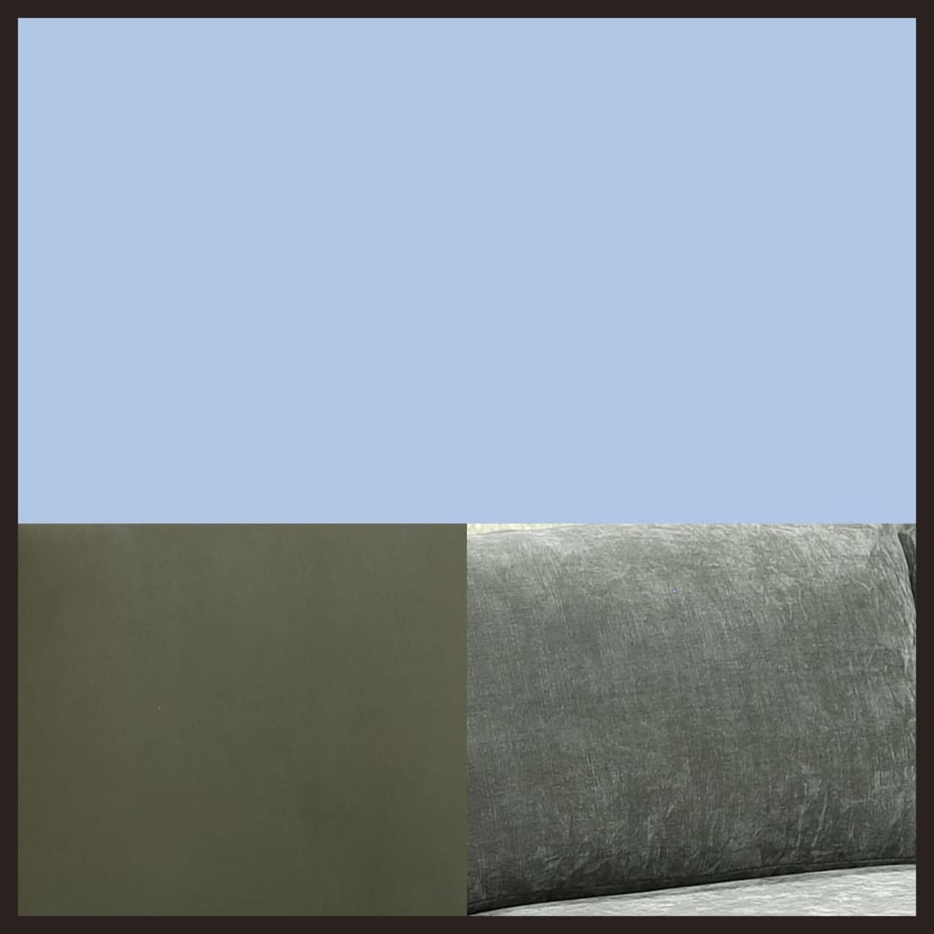
Unexpected Color Pairings
- Pale pink and peach: An unconventional but fascinating pairing that feels modern and fresh.
- Sage green: Natural and calming, perfect for eco-friendly or nature-inspired spaces.
- Orange-red accents:The "Sunset Glow" approach creates energizing contrast and dynamic impact.
Material Marriages
- Light wood: Creates Nordic-style interiors with clean lines.
- Dark wood: Adds classic or ultra-contemporary contrast.
- Marble: In light or white shades, especially in kitchens and bathrooms.
- Metallic finishes: Brass, gold, and polished chrome all complement sky blue beautifully.
2 Best Rooms for Powder Blue Skies: Living Room and Bedroom
How to use Powder Blue Skies in the Living Room:


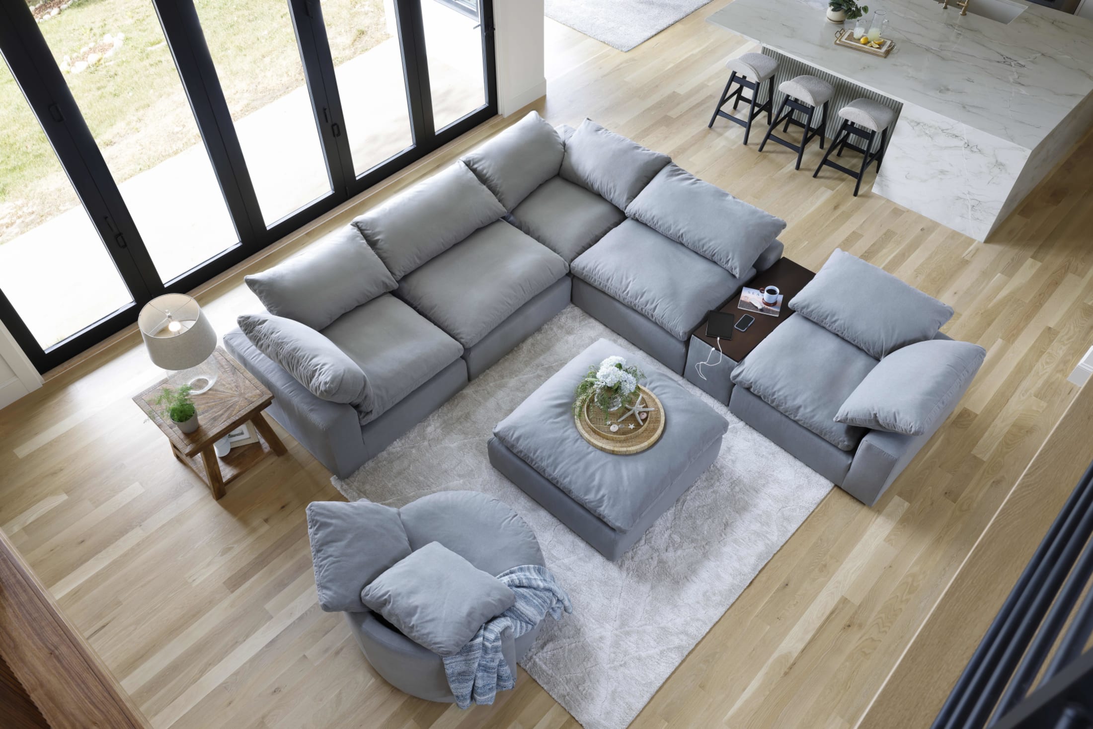
If there’s one place Powder Blue Skies truly shines, it’s the living room—because this airy blue can go big with statement seating, or it can play it cool in layered accents without ever feeling loud. It’s that “fresh breath of air” color that instantly lifts a space, even when the rest of your palette stays neutral.
Here are our recommendations for how to use Powder Blue Skies in the living room:
Statement Sofas (the anchor piece)

A Powder Blue Skies sofa is the ultimate living room power move: it’s bold enough to define the room, but soft enough to stay timeless.
- Style tip: let the sofa do the talking, then keep the supporting cast simple—creamy neutrals, warm woods, and a touch of metallic shine make this blue feel especially elevated.
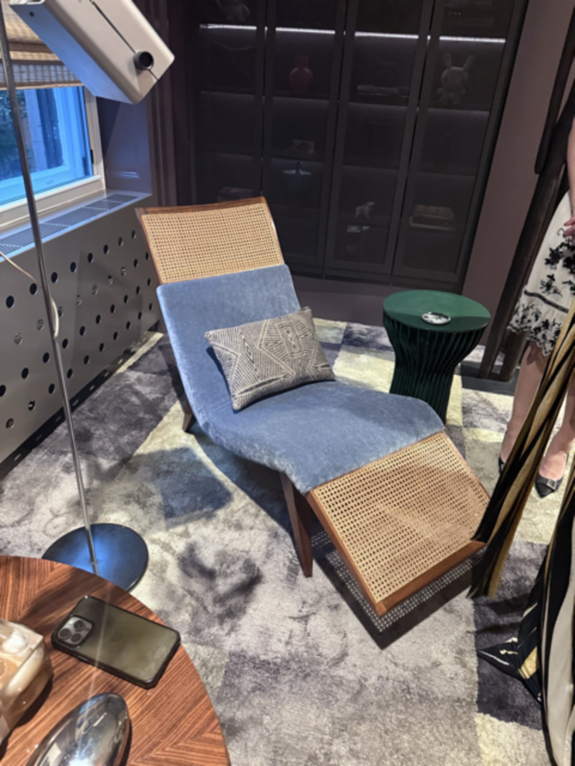
Accent chairs + swivel seating (easy upgrade, big impact):
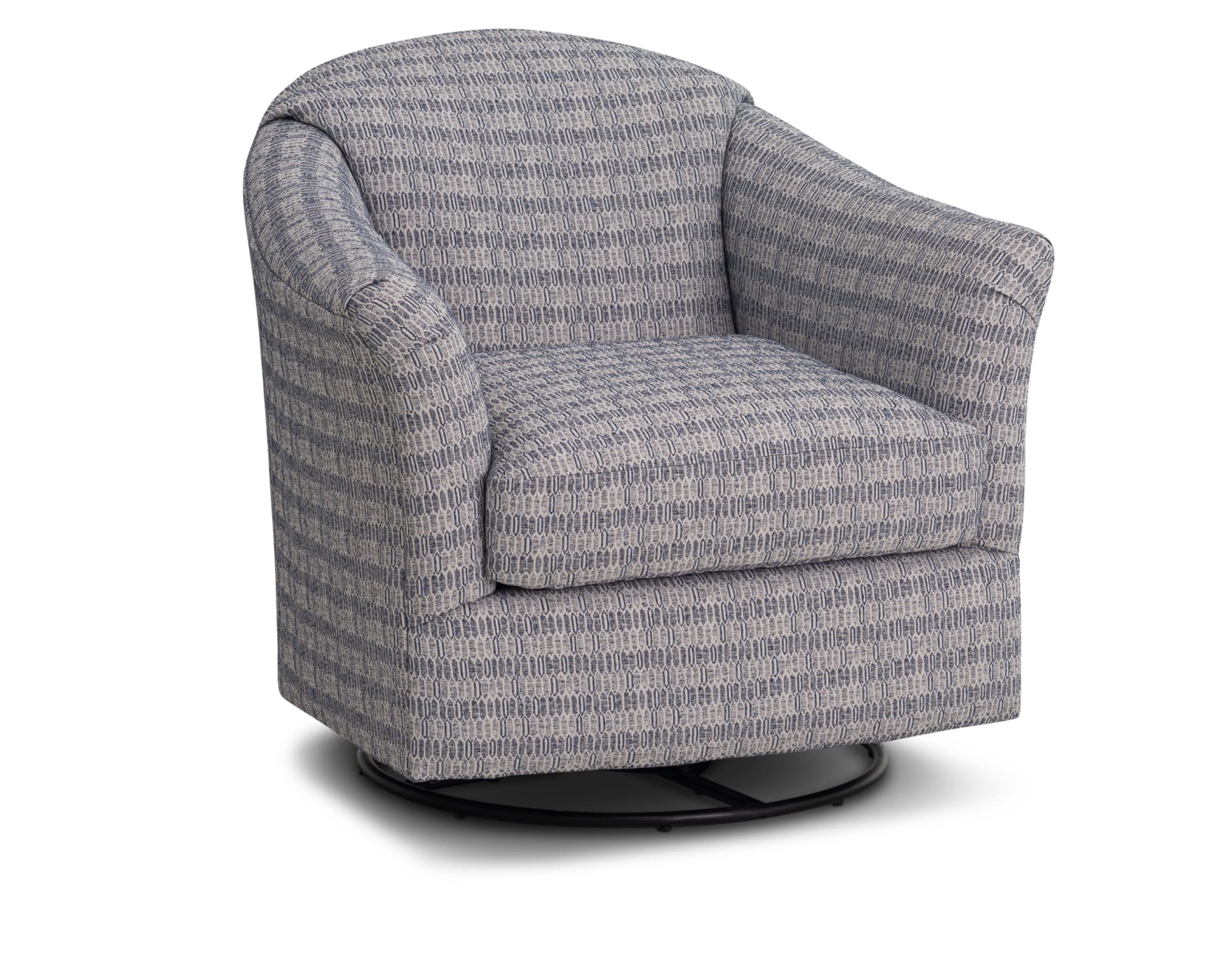
Not ready to commit to a full sofa? A Powder Blue Skies accent chair gives you the same color payoff in a smaller dose. Pair one chair with a neutral sofa, or place two across from your sectional to create an instant conversation zone.
- And if you want your living room to feel more “2026,” go for swivel chairs: we spotted swivel chairs trending at the most recent High Point Market furniture show.
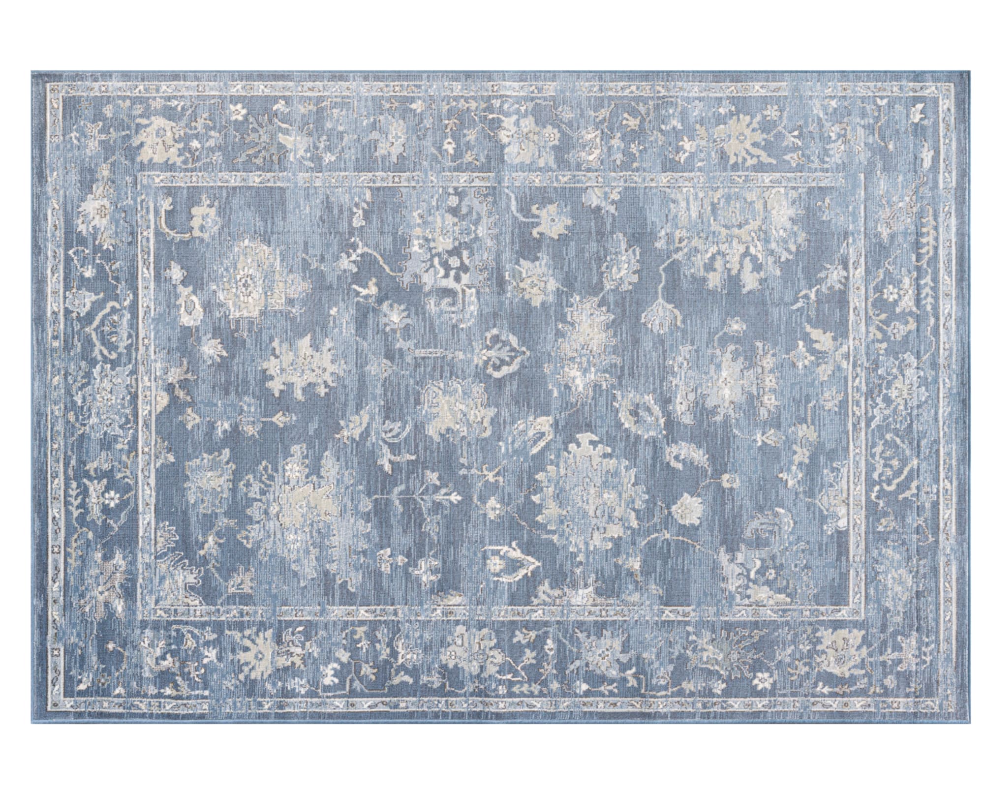
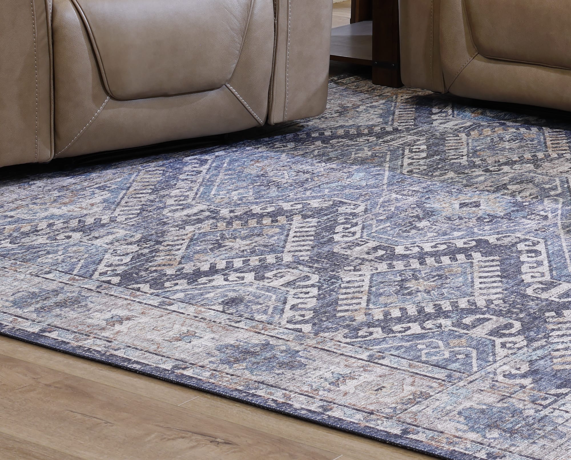
Rugs + decor (the low-commitment layer):
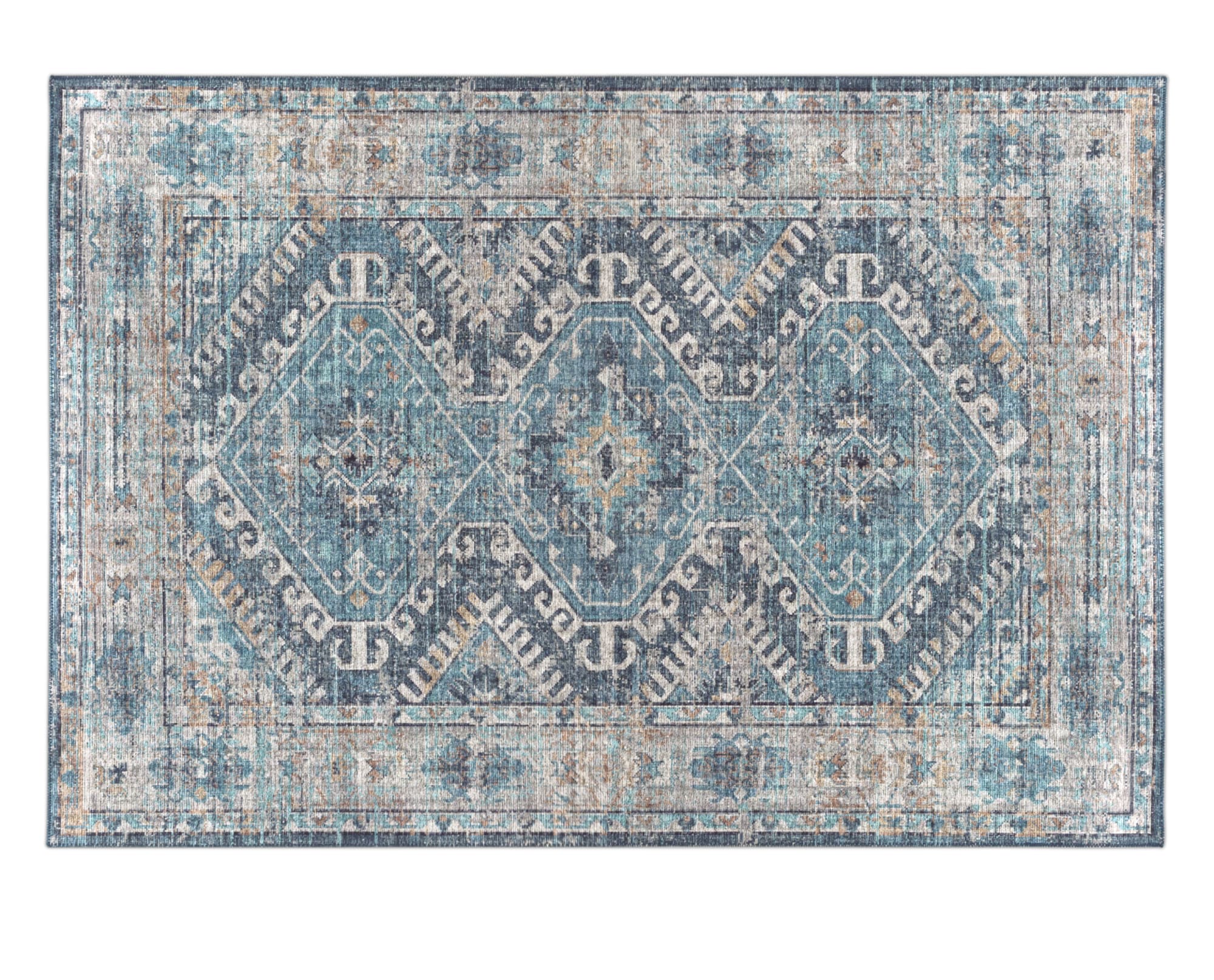
Powder Blue Skies also works beautifully as the “tie-it-all-together” color through textiles and styling.
- Rugs: Choose a patterned rug that includes hints of powder/sky blue to soften the room and connect your seating pieces.
- Pillows + throws: Mix textures (think cozy weaves + smoother fabrics) so the blue feels layered, not flat.
- Decor: Try blue glass, ceramic vases, or art with that airy blue note—small touches that still make the room feel intentional.
How to Use Powder Blue Skies in the Bedroom
Powder Blue Skies is basically made for the bedroom: it’s soft, soothing, and instantly makes the space feel more like a retreat than a to-do list. Blue shades are often linked with relaxation because they can remind us of calming natural scenes like clear sky and water. In lighter tones—like powder blue—the room can also feel more open and airy (not cold).
Here are our recommendations for how to use Powder Blue Skies in the bedroom:
Walls and built-ins (set the mood):
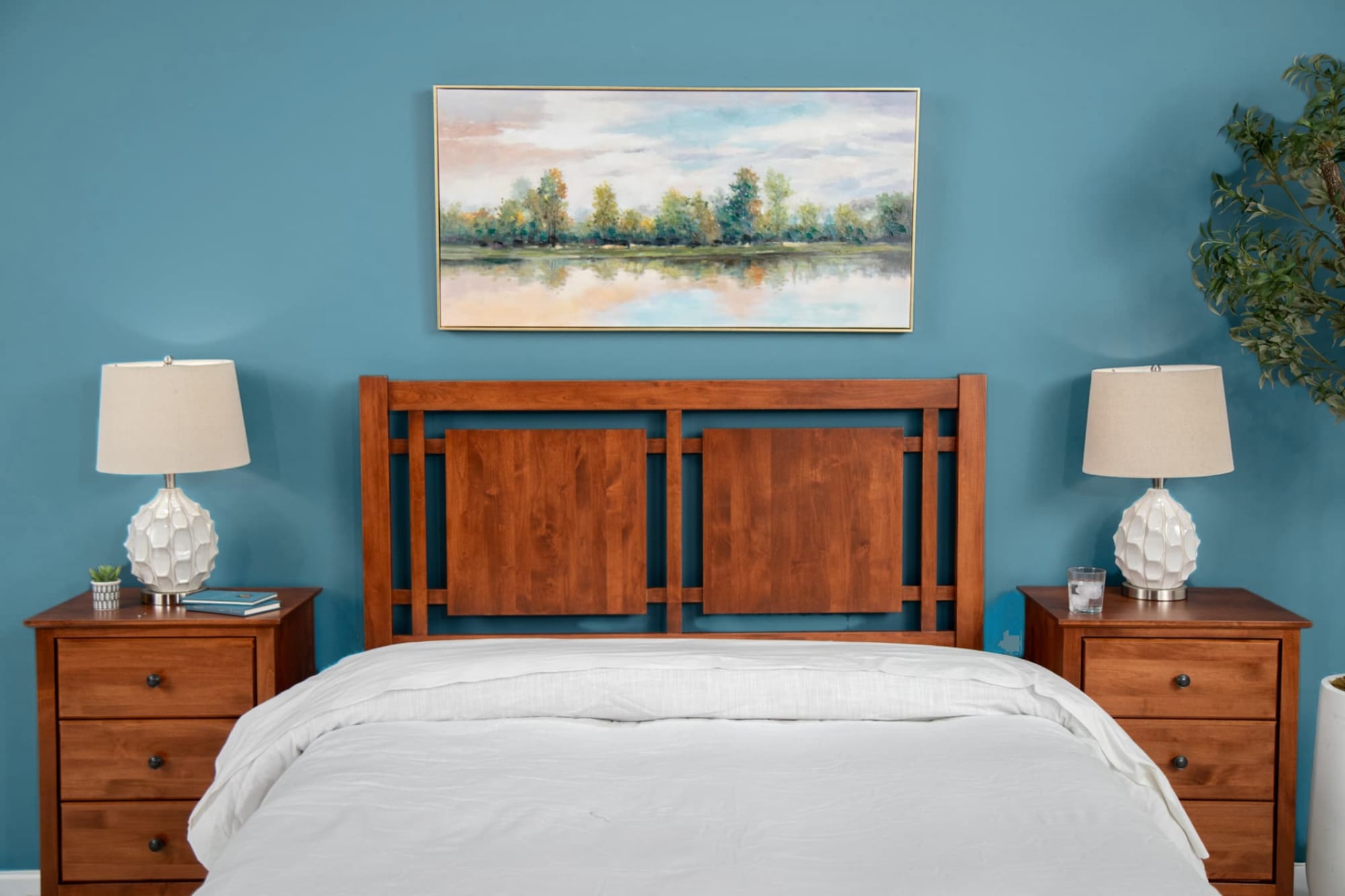
If you want the most immersive “powder sanctuary” effect, bring Powder Blue Skies to the walls—either all-over or as an accent behind the bed. Lighter powder and sky blues work especially well in bedrooms when paired with creamy whites and natural wood tones for a clean, elevated look.
- If you have built-ins, painting them in this shade is also a designer move: it adds color and function without adding clutter.
- For a lower-commitment version, paint just your trim or interior doors in a darker Powder Blue Skies to carry the color throughout the room.
Accents with color (make it feel intentional):
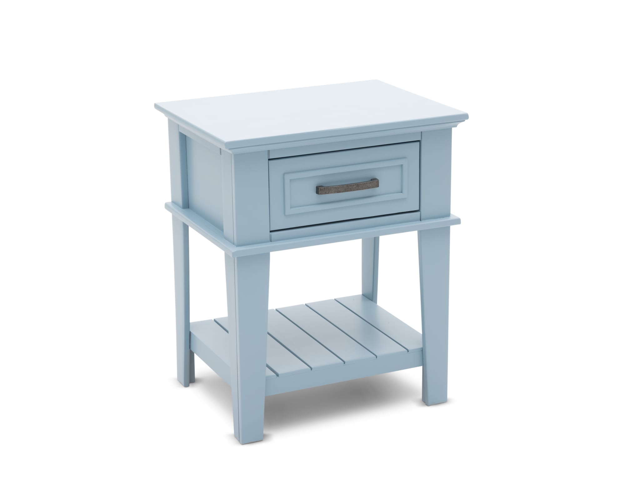
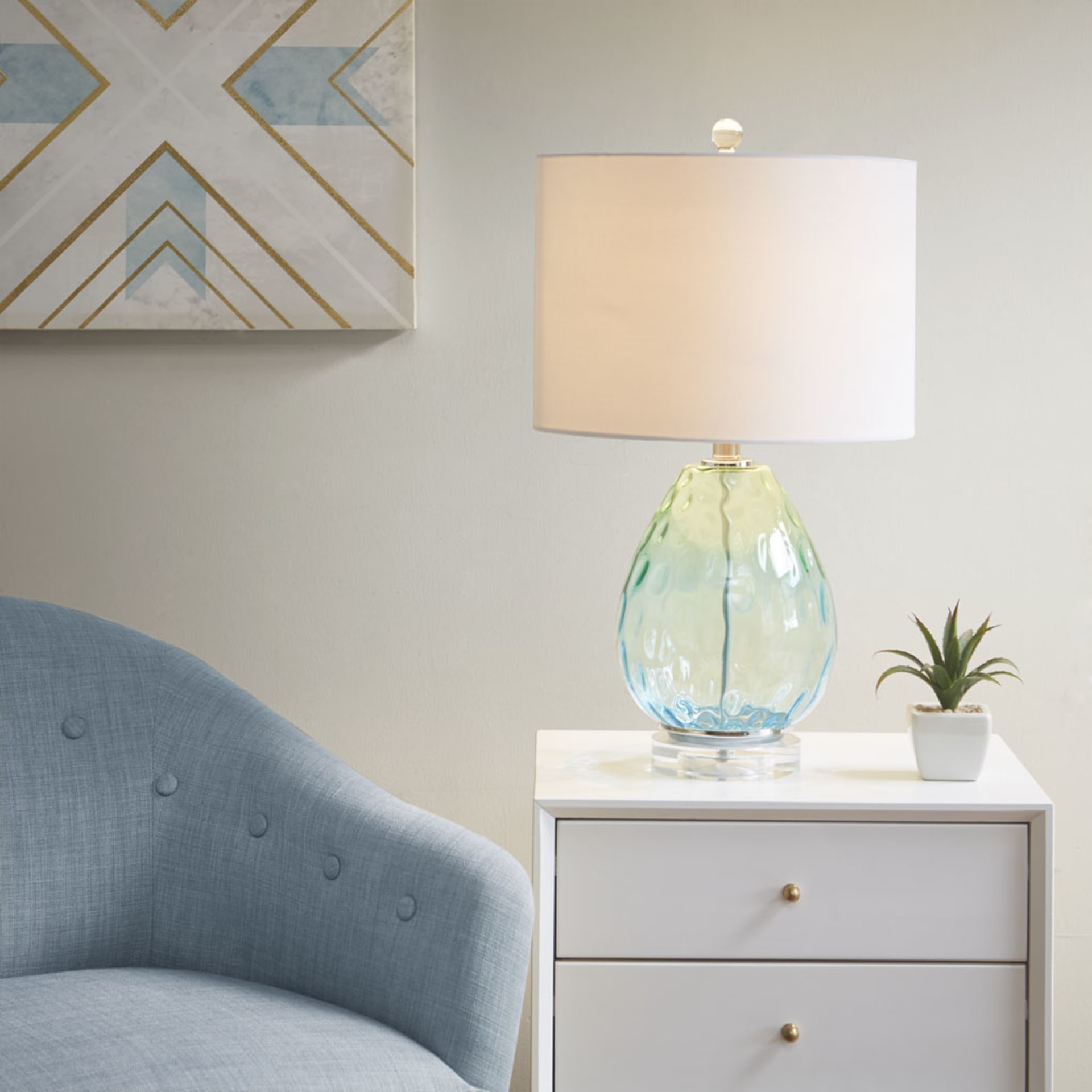
If you want to bring Powder Blue Skies into the bedroom without committing to a full paint job, go for a standout accent—like a blue nightstand or table lamp—and let it set the tone for the rest of the space.
- For the most pulled-together look, pick 2–3 “anchor” colors (powder + sky + a deeper cornflower accent) and repeat them in different ways around the room, not just in one spot.
Bedding and Rugs (soft layers, calm payoff):
Let Powder Blue Skies show up where it matters most—on the bed and underfoot—so the whole room feels like a dreamy, put-together retreat.
- Bedroom rugs: Go for a Powder Blue Skies area rug—either a soft solid, a faded/vintage-style wash, or a pattern that mixes powder blue one of the colors mentioned above.
- Pattern-mixing: Stick to low-contrast patterns—try thin pinstripes in sky blue with white for a crisp, cloud-like look, or watercolor florals in pale blue with warm ivory. Learn more about fabric patterns here!
- Bedding layers: Mix 2–3 blues (powder + sky + a deeper cornflower accent) across sheets, quilts, and throws for that serene “color story” without feeling matchy-matchy.
Final Tips: Make Powder Blue Skies Feel Effortless
Powder Blue Skies is light, optimistic, and surprisingly flexible—so the goal is to use it in ways that feel intentional (not theme-y).
- Check undertones first: Hold your powder blue pick next to your wall color and flooring in daylight and at night—this shade can read crisp, icy, or slightly soft depending on lighting.
- Try it on “in-between” pieces: Curtains, a bench at the foot of the bed, an entryway ottoman, or dining chairs give you a noticeable pop without changing your whole room.
- Use it in patterns (not only solids): A rug, drapery, or bedding with powder blue woven into the design makes the color feel more layered—and easier to live with.
- Repeat it 2–3 times: One powder blue moment can look accidental; repeating it (like art + a vase + a throw) makes it feel styled on purpose.
- Warm it up when it feels too cool: If the room starts leaning chilly, bring in warmer textures—natural wood, cozy knits, and warm-toned neutrals help keep the vibe inviting.
- Make it “season-proof”: In spring/summer, pair it with light neutrals; in fall/winter, keep the blue and swap in deeper accents (like richer woods or warmer metals) so it still feels fresh.
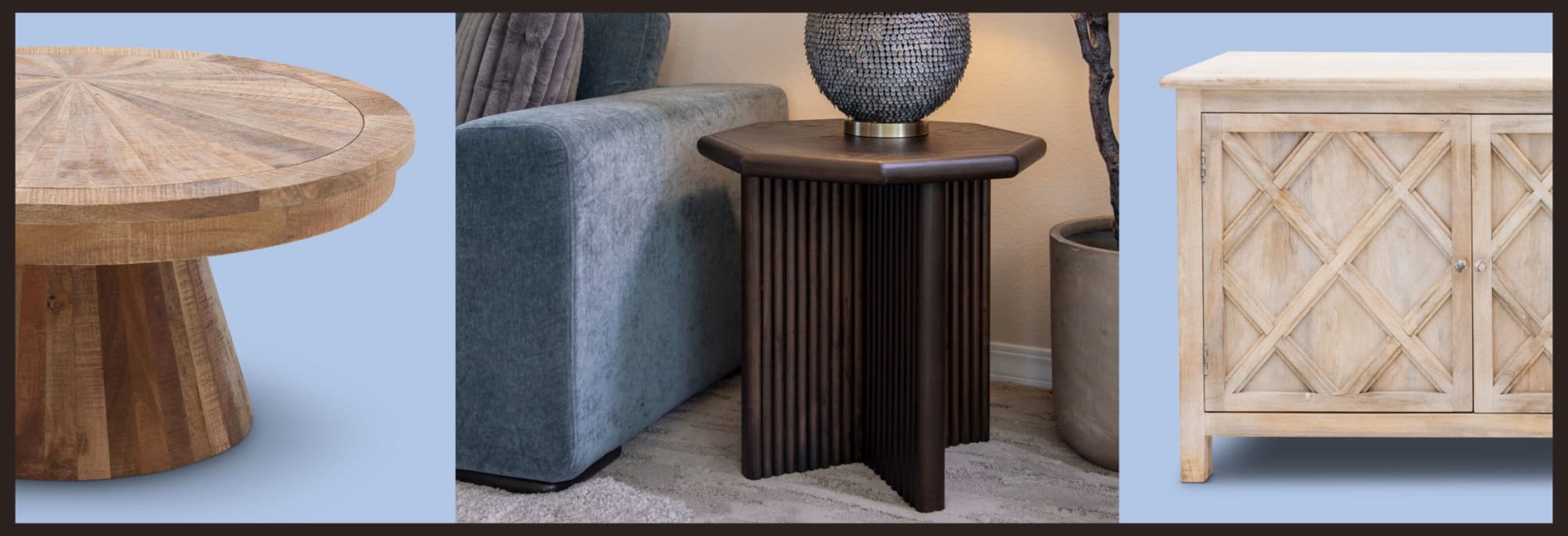
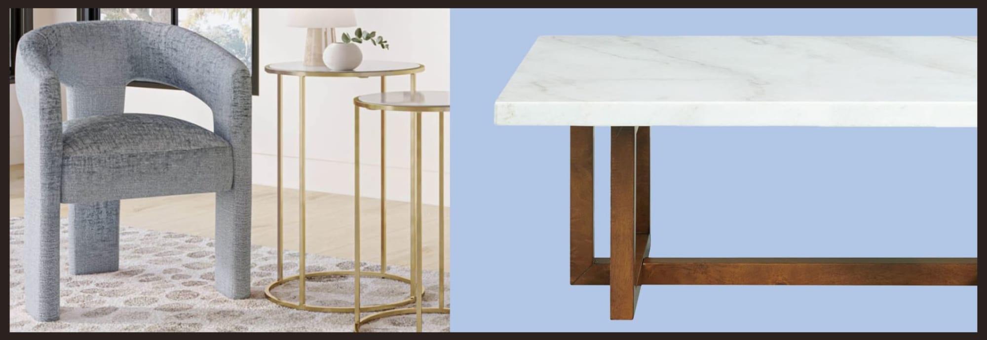
The Furniture Row Powder Blue Skies Edit
Powder Blue Skies isn't just a color—it's a mood, an attitude, a design philosophy that values both beauty and livability. It's proof that you don't have to choose between trendy and timeless, bold and serene, classic and modern.
At Furniture Row, we're stocking pieces that make incorporating this trending shade effortless. This is the year to embrace a shade that works as hard as you do, adapting to your life while elevating every room it touches. Welcome to the Powder Blue Skies era.
Check out More From Our Blog
Go to the Blog
2026 Furniture & Design Trends
Discover top 2026 interior design trends from High Point Market, featuring retro sofas and bold colors.
Maximalism is Having a Moment: Go Bold in 2026
Discover top 2026 home decor trends and learn how bold, maximalist furniture transforms your space.
How to Mix and Match Furniture Styles
Learn expert tips for mixing furniture styles, colors, and materials to create a beautifully cohesive, personality-filled home.